The Process
Brand Identity
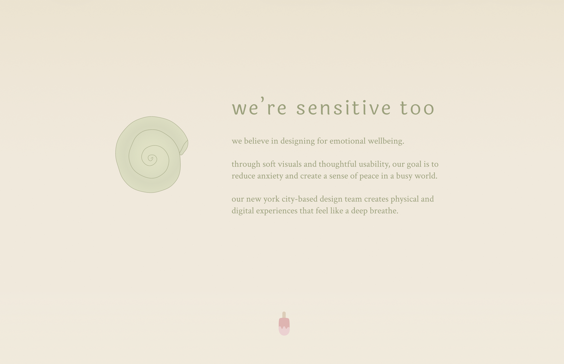
First I defined the studio's identity by digging into their mission, energy, tone, and past projects. The studio's mission focused on creating digital experiences that felt gentle and supportive, and reduced anxiety. Their previous projects demonstrated soft visuals, attention to usability, and a peaceful yet joyous energy.
Mood Board
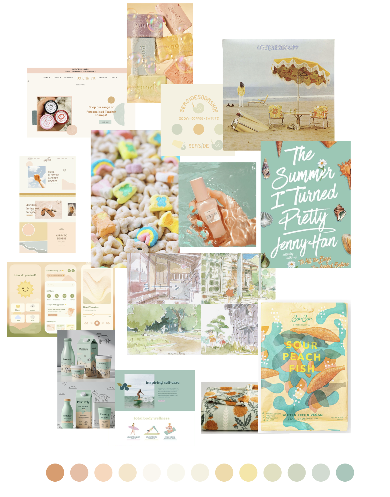
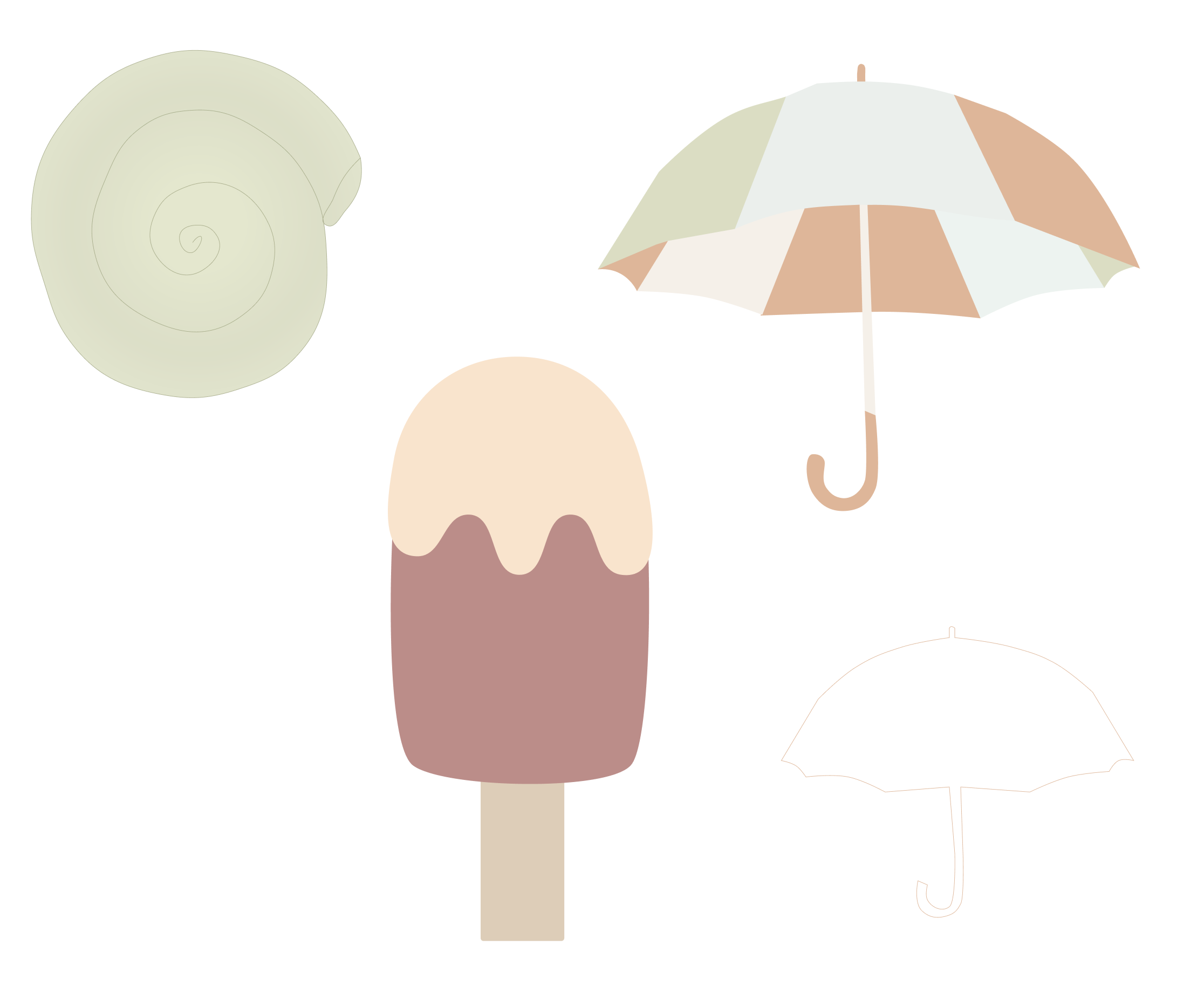
To translate the studio's identity into a tangible visual direction, I curated a mood board centered around the concept of a joyful oasis. I wanted the visual language to evoke slow, gentle, and calm vibes, while weaving in playful details that sparked joy.
Visual themes emerged from the mood board, including impressionistic and fluid forms, near-complimentary warm and cool tones, and breeziness.

Design References
Next I curated design inspiration, looking for products with soft visuals, breezy and approachable forms or layouts, and a peaceful yet joyous energy.
Color Exploration
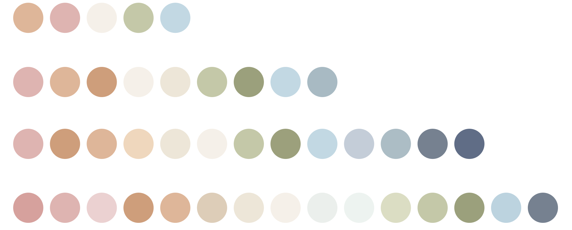
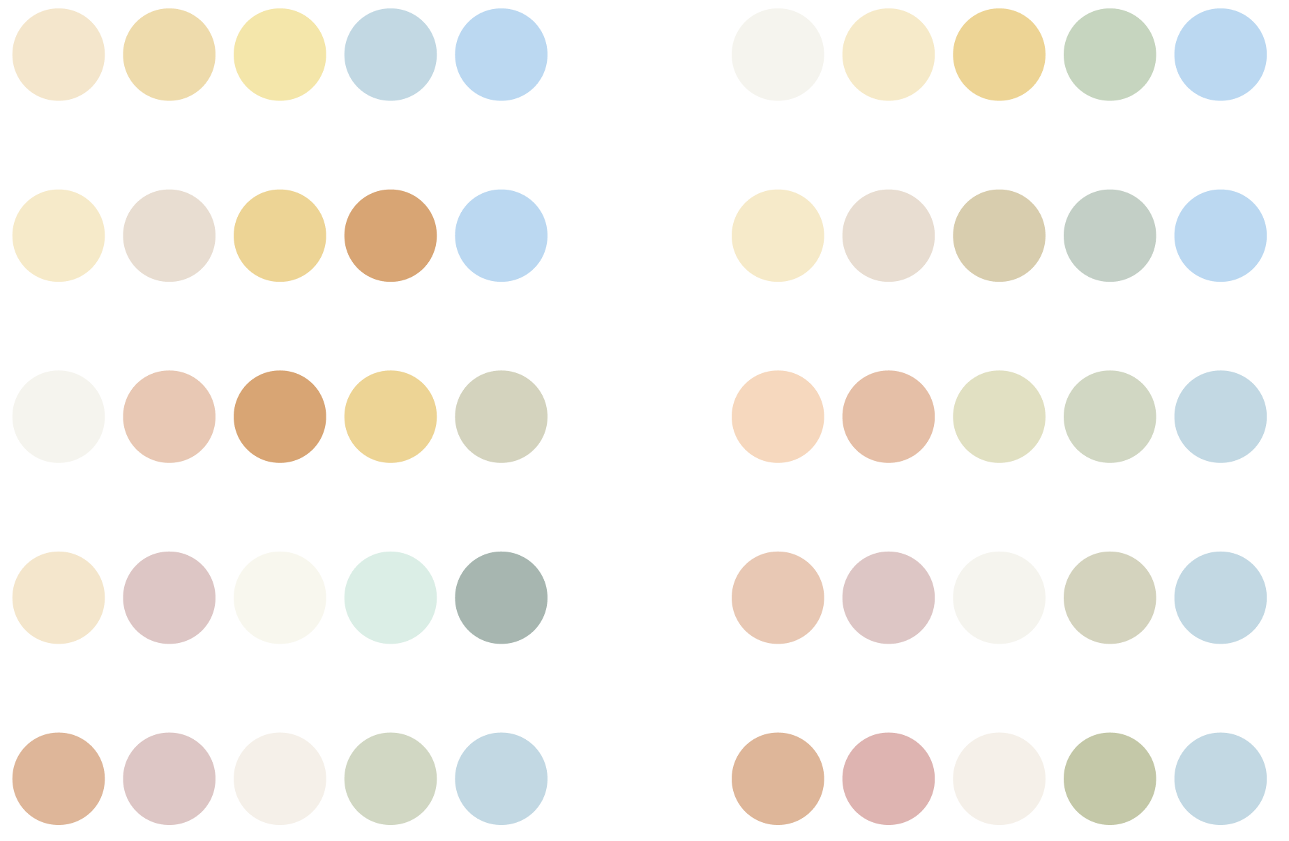
Based on the mood board and design inspiration curation, I explored color pallettes to capture the same calm, gentle, and quietly joyful identity. I played around with analogous warm hues to evoke comfort and friendliness, paired with cool tones to bring calm and serenity.
Typography Exploration
As I explored typography, I leaned towards humanist sans-serifs with approachable, fluid forms. I also experimented with old style serifs for grounded, warm pairings.

Layout Exploration
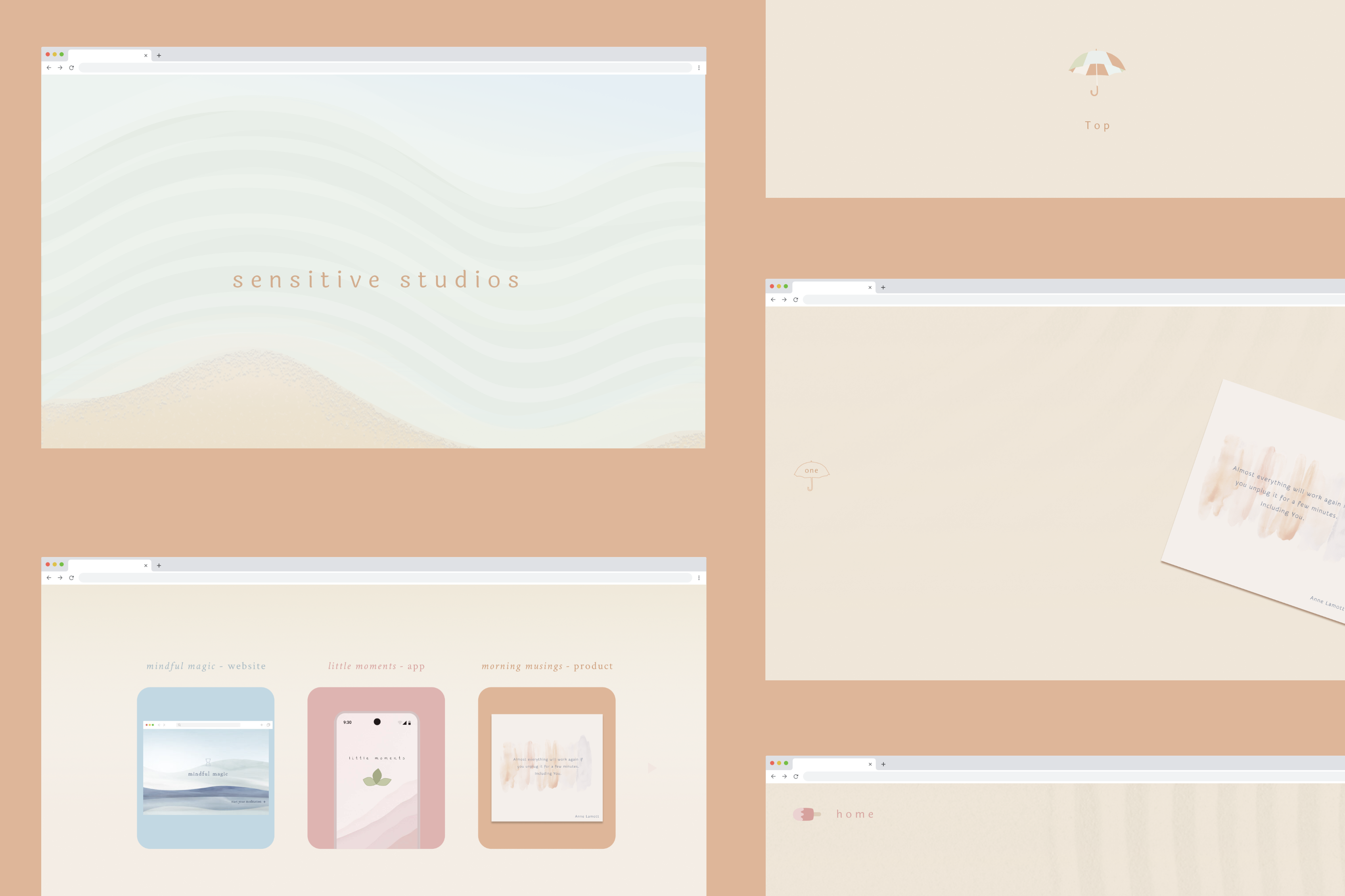
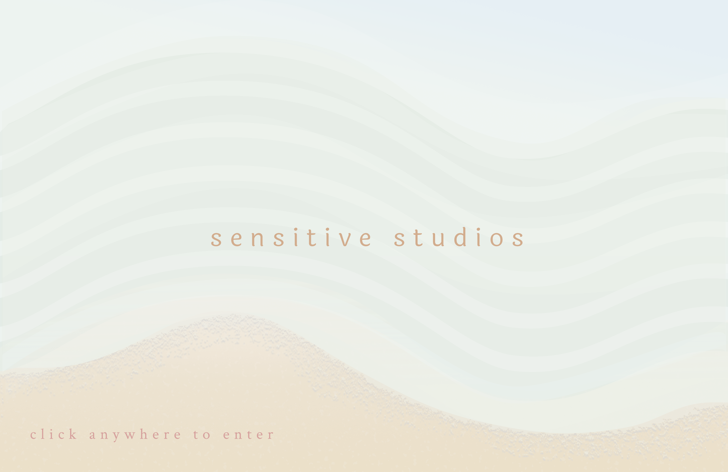
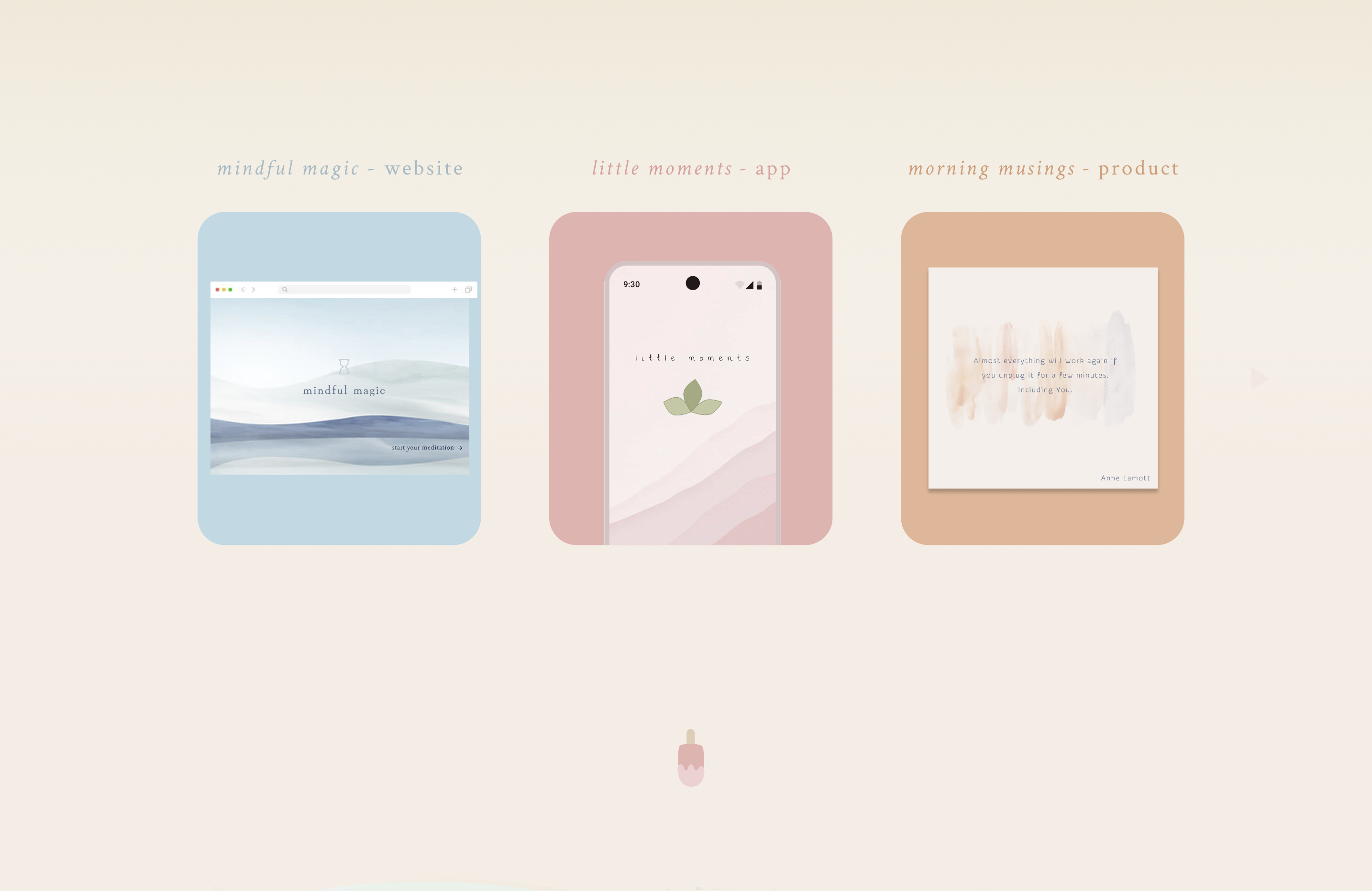
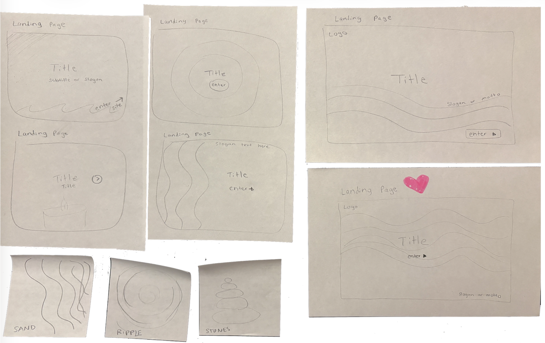
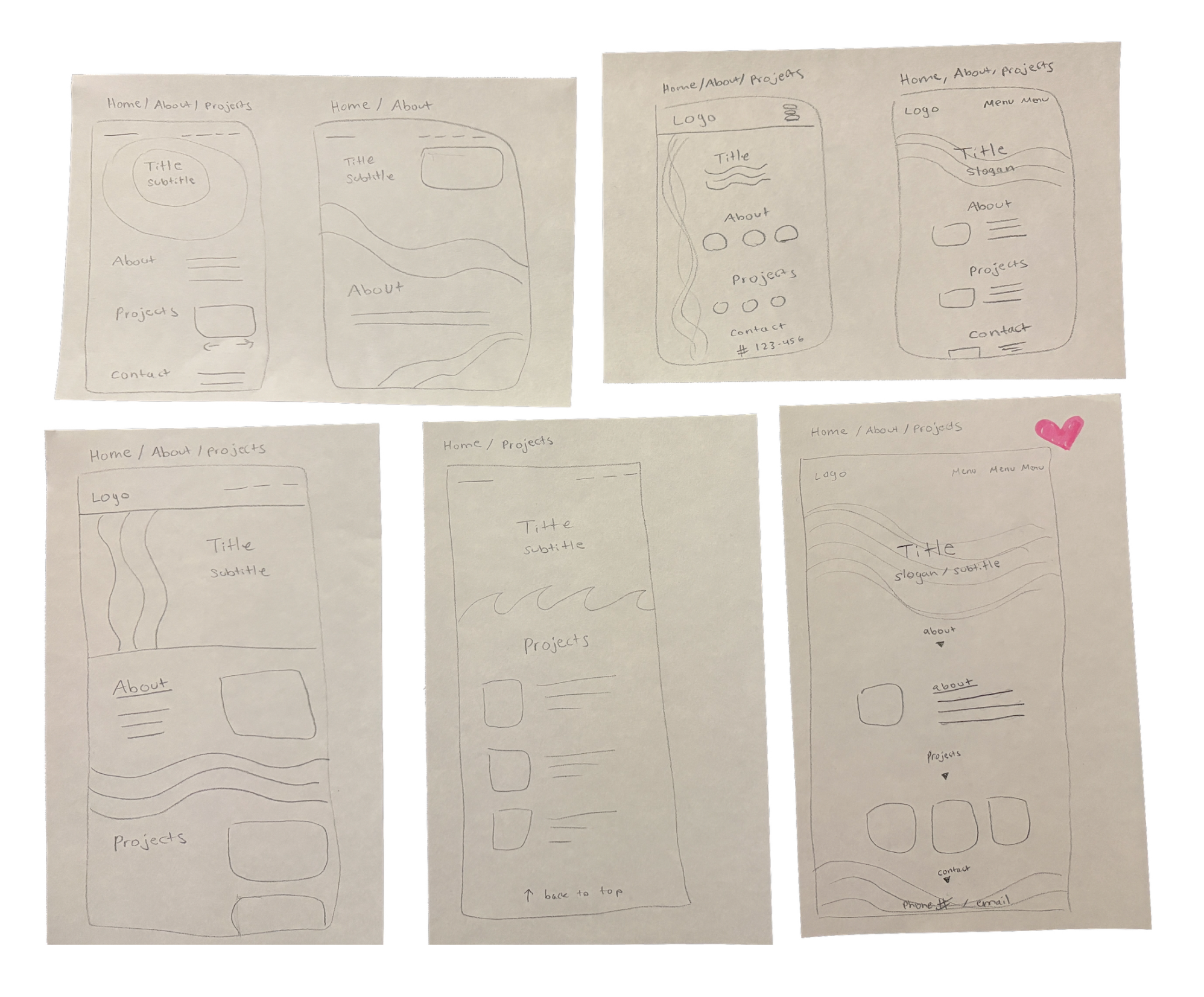
As I iterated on the key components of the design system, I began sketching ideas for the studio's website. In the layout, I used generous space to create the feeling of breeziness, and texture-inspired shape motifs to support a joyful interaction without disrupting the peace.
Texture Exploration
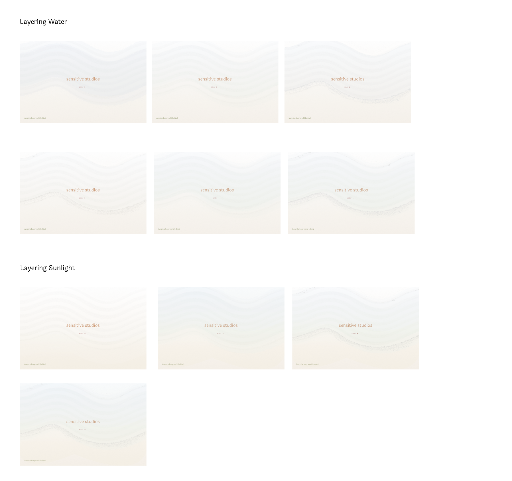
I iterated furthur with textures as I moved into low fidelity mockups, layering color and fluid forms to create a picture of serenity and furthur evoke the oasis feeling.

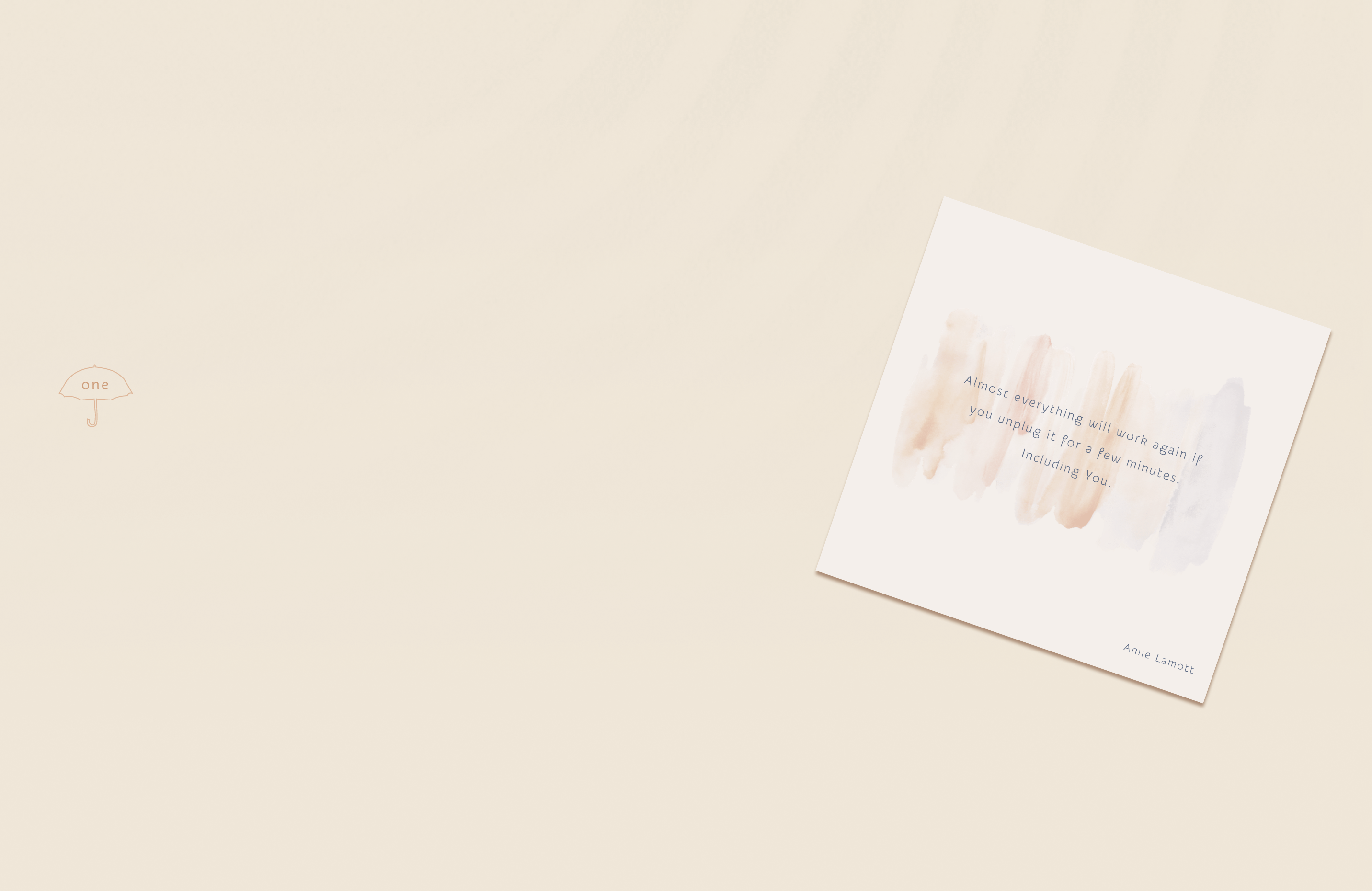
Motion Exploration
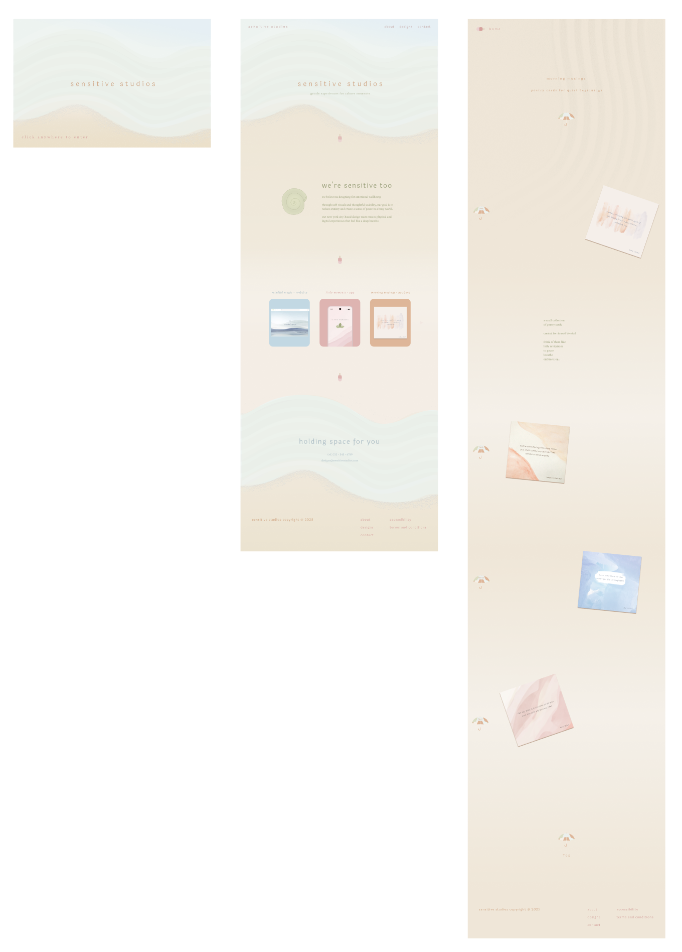
As I moved into high fidelity mockups, I utilized space to make the scroll feel breezy and slow. This created a peaceful enviornment, while keeping the user experience simple and supportive.
A slow scroll also allowed for popping colors and hand-drawn shapes to evoke joy at the users' pace.
Feedback
To help me strengthen and fine-tune the design work, I participated in multiple designer critique sessions, iterating on the color palette and layout based on feedback. A key takeaway from one critique session was that the original typography proportion didn't align to the breezy feeling I wanted to capture, leading me to increase the proportion by 30%.
To ensure resonance with unique perspectives, I paired these critiques with informal non-designer viewing sessions. Reactions from these sessions led me to reduce the brightness of the background color, and lower the values of the color palette all together.
Final Design System
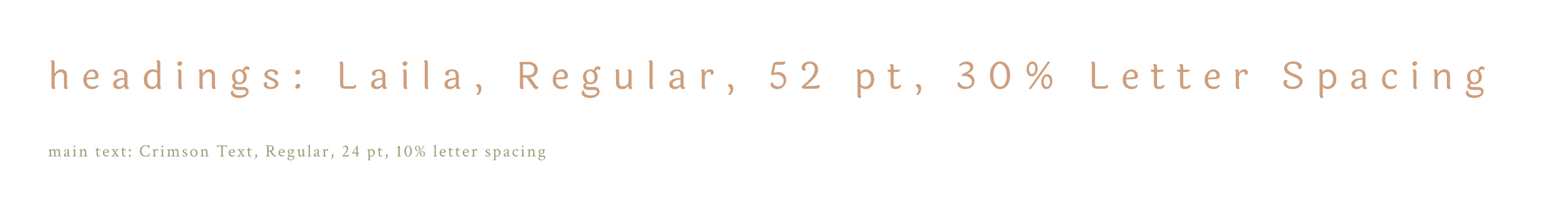
For the final typography I chose Laila, a Humanist Sans-Serif font for headings, because of it's welcoming vibe and personal-feeling curve to the letters. I increased the letter spacing to make it more airy and give it a slowness, and used lowercase text instead of titlecase to give it a unique calmness. For the main content I chose Crimson Text, an Old Style Serif to support readability, and bring a warm, grounded feeling.
The color palette grew as I iterated on the website design. I used analogous saturation to create a harmonious, consistent visual experience. Analogous warm hues evoked comfort and friendliness, paired with cool tones to bring calm and serenity. For the green and blue hues I chose near-complementary colors to reduce visual tension. To organize the UI, I used analogous values within three categories: background, moments of joy, and headings & main content.
The complete visual design system captured a gentle and supportive digital oasis.